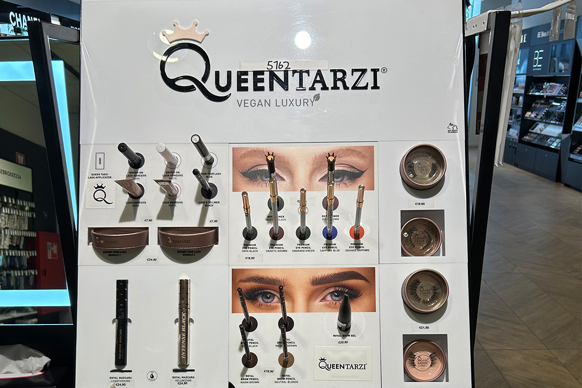
Limited retail space doesn’t have to be a constraint on a strong in-store presentation. With a smart “shop-in-shop” concept, you can create a more relaxed atmosphere, better organization, and a stronger brand experience on the sales floor. Especially in compact stores, shop-in-shop displays help present products in a clear and organized way and allow customers to find their way around more quickly.
In this blog, you’ll discover how smart retail presentation creates a clear store layout, draws more attention to products, and enhances the shopping experience.
Table of Contents
A shop-in-shop display is a separate brand or product environment within an existing store. It’s like creating a mini-store within a larger retail concept. Think of a cosmetics brand inside a department store, a coffee corner in a supermarket, or an electronics brand with its own display area.
The purpose of a shop-in-shop concept is clear:
Make products stand out more
Create a stronger brand experience
Bring structure to the sales floor
Encourage impulse purchases
For retailers, this offers a smart way to present different product groups in a clear and organized manner. For brands, it provides greater control over their image, presentation, and product placement.
Einzelhändler bieten auf immer weniger Quadratmetern ein immer umfangreicheres Sortiment an. Gleichzeitig erwarten Verbraucher ein angenehmes Einkaufserlebnis mit klarer Wegführung und inspirierender Präsentation.
Ein „Shop-in-Shop“-Display hilft dabei, verschiedene Marken und Produktkategorien logisch voneinander abzugrenzen. Das sorgt für Ruhe und eine übersichtliche Ladengestaltung.
Auch das Einkaufserlebnis spielt eine immer größere Rolle. Verbraucher möchten nicht nur Produkte betrachten. Sie suchen beim Einkaufen nach Inspiration, Atmosphäre und Komfort.
Untersuchungen zum Verbraucherverhalten zeigen, dass übersichtliche Geschäfte zu einer längeren Verweildauer und einer höheren Kaufabsicht beitragen.
A common mistake in retail is displaying too many products in a limited space. This creates visual clutter, and customers quickly lose track of what’s available.
A smart shop-in-shop concept prevents that problem.
Dividing the store into distinct zones automatically creates more structure.
For example:
As a result, customers can figure out where to look more quickly.
A display doesn’t have to be completely filled to make an impact. In fact, open space helps create focus and a more luxurious look. Fewer visual stimuli often result in more attention being paid to each product.
Open sightlines make a store feel larger. Low displays at the front and taller displays at the back help create more depth. Open structures therefore often work better than enclosed fixtures.
Consumers form their first impression of a store environment within seconds. A calm and clear layout helps visitors find their way around more quickly. This has a direct impact on purchasing behavior.
A well-organized store:
Retail research shows that a large proportion of purchases are made on impulse. Eye-catching retail displays along customer pathways, in particular, attract extra attention.
Effective in-store presentation is therefore not about displaying as many products as possible. It’s about presenting them smartly.
In compact stores, every square meter counts. That’s why vertical merchandising is a smart solution. By making smart use of vertical space, you can create additional display space without taking up extra floor space.
Common solutions include:
Vertical displays don’t just create extra space. They also often make a store look larger and more organized.
A combination of wall-mounted and freestanding displays creates balance on the sales floor. At Dutch Display, we offer custom-made displays designed to ensure that space is always used optimally.
Not every display solution works well in small retail spaces. Compact stores require smart and flexible presentation systems.
Popular solutions include:
Modular systems are popular because they can be easily adapted to new campaigns or seasonal changes.
The choice of materials also plays an important role. Wooden displays create a warm, inviting atmosphere, while metal displays often give a modern look.
Lighting makes all the difference in attracting attention. LED lighting, in particular, helps draw extra focus to products.
Tip: Could you use some help choosing the right display? Then check out our blog post “Common Mistakes When Choosing a Display.”
Routing determines how customers move through a store. A smart walking route ensures that visitors automatically pass by key displays. This increases the likelihood of interaction with products.
For shop-in-shop displays, routing is all about:
Many consumers automatically move to the right when they enter a store. That’s why new collections and premium products are often placed on that side of the store. Displays at intersections and end caps also attract extra attention.
Many well-known brands use shop-in-shop concepts to showcase their brand more effectively within existing retail environments.
Rituals
Rituals uses recognizable visual concepts centered on scent, ambiance, and luxury. Consistent use of color and well-organized displays create instant brand recognition.
Apple
Apple opts for minimalist displays with plenty of open space. This ensures that products receive maximum attention and the store feels uncluttered.
Nike
Nike uses shop-in-shop displays to present collections by sport or target audience. This makes it easier for visitors to find their way around.
Nespresso
Nespresso combines premium materials, lighting, and product demonstrations to create a luxurious shopping experience within larger retail environments.
These examples show that effective in-store presentation is all about structure, recognizability, and the shopping experience.
What is the advantage of a shop-in-shop display?
A shop-in-shop display provides greater clarity, better product presentation, and a stronger brand experience within an existing retail environment.
Which displays work best in small stores?
Modular displays, wall displays, and vertical displays work well in compact stores because they take up minimal floor space.
How can you improve the overview in a store?
Use clear zones, open sightlines, and logical customer flow. Give products enough space so customers can get a quick overview.
Why are modular displays popular?
Modular displays are flexible, reusable, and easy to adapt to new campaigns or collections.
What is the difference between a retail display and a shop-in-shop display?
A retail display showcases products within a store. A shop-in-shop display creates a complete brand or product environment within an existing retail space.
A successful shop-in-shop display isn’t about showcasing as many products as possible. It’s about smart presentation, clear customer flow, and a pleasant shopping experience.
Strategically organizing retail space creates a more relaxed atmosphere, better visibility, and a stronger brand experience. This not only gives the space a professional look but also increases the likelihood of sales.
Would you like to develop a shop-in-shop display that perfectly aligns with your retail space, brand identity, and target audience? Dutch Display helps retailers and brands with smart display solutions that ensure clarity, visual appeal, and maximum impact on the sales floor. Contact us and discover how your sales floor can be designed to be smarter, more organized, and more commercially effective.
A counter display may seem like a small part of a store’s interior design, but it has a significant impact on purchasing behavior. Many impulse purchases happen right at the checkout. The right dimensions therefore determine whether a display stands out or is ignored.
Too tall, too wide, or too cluttered? Then a display quickly loses its impact. A smart layout, on the other hand, creates clarity, attracts more attention, and enhances product presentation. In this blog, you’ll discover which height, width, and structure work best for a counter display and how smart presentation influences sales and the in-store experience.
Table of Contents
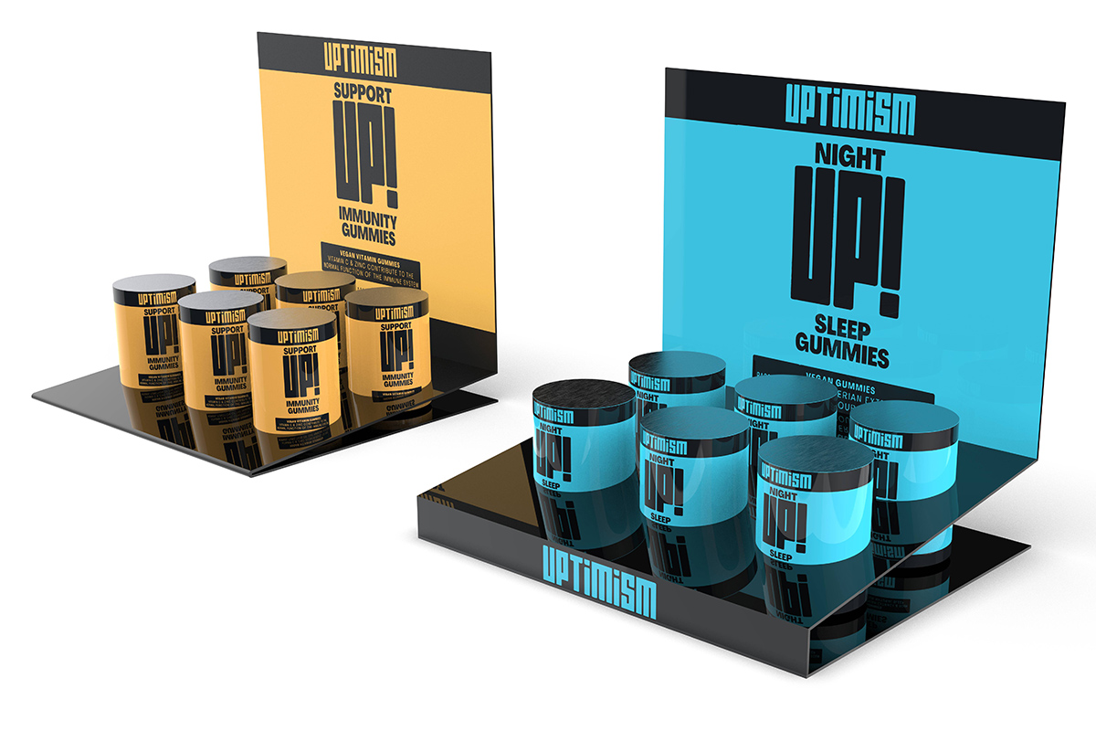
A counter display is located exactly where customers wait, pay, or take one last look around. That makes this spot extremely valuable for retailers.
Research on consumer behavior shows that many impulse purchases take place near the checkout. Small products with a low purchase barrier do particularly well here.
A well-placed counter display:
Juist daarom spelen afmetingen een grote rol. Een display moet opvallen zonder de toonbank druk of onpraktisch te maken.
The ideal height for a counter display is often between 20 and 45 centimeters. This ensures good visibility without blocking sightlines.
Displays that are too tall usually have the opposite effect. They disrupt the interaction between staff and customers and make the counter look cluttered. Small stores also tend to feel more crowded when displays take up too much vertical space.
A lower display, on the other hand, ensures:
Many successful displays use a tiered design. This keeps products visible without making the display look bulky.
A counter display doesn’t have to take up the entire counter to be effective. In fact, compact displays often attract more attention.
In many stores, a display works best when it takes up about a quarter to a half of the available counter space.
That leaves room for the cash register:
Displays that are too wide can quickly create visual clutter and limit employees’ workspace.
For small stores, narrow, custom-made vertical displays are often a smart solution. They take up very little space yet remain clearly visible.
Depth is often underestimated when designing a counter display. A display that is too deep obstructs payment terminals and makes products difficult to reach.
In practice, many effective displays are between 15 and 30 centimeters deep.
This provides enough space for:
A compact depth also helps keep the counter neat and organized.
Many brands want to showcase as many products and promotional materials as possible in a small space. Yet simplicity often works better.
The brain prefers clarity. When a display becomes too cluttered, it creates visual overload. As a result, customers have a harder time figuring out what to look at.
A clean, uncluttered counter display:
Retail research shows that consumers make decisions more quickly in well-organized store environments.
Effective displays therefore use:
It should be clear within a few seconds:
The shape of a counter display determines how customers experience and approach products.
Tiered displays
These displays ensure good visibility of multiple products at once. This keeps small packages, in particular, clearly visible.
Vertical displays
Narrow vertical displays work well on compact counters where space is limited.
Square displays
Square displays are practical for small promotions, gift items, or compact products.
Round displays
Round shapes attract extra attention because they stand out from the straight lines commonly used in many stores.
Ultimately, the best shape depends on:
Lines of sight play a major role in store displays. Customers need to be able to see products immediately without a display blocking their view of other items.
People often look automatically:
That is why products placed at eye level and at the front usually attract the most attention.
Open sight lines also ensure:
That explains why compact displays often work better than large, bulky presentations.
Counter displays are particularly well-suited for high-impulse-purchase items, such as candy, batteries, phone accessories, lip balm, mini personal care products, gift cards, travel-size items, and small gadgets. Customers often make quick decisions when it comes to these products. That’s why visibility, accessibility, and an eye-catching presentation play a more important role than detailed product information. Limited-time promotions and seasonal products also often perform well at the checkout because they immediately catch the customer’s eye while they’re paying.
The material largely determines the look and feel of a counter display.
Cardboard
Cardboard is popular for temporary sales and promotions. It is lightweight, affordable, and fully printable.
Plastic
Plastic displays are sturdy and suitable for long-term use. They often have a modern look.
Metal
Metal creates a sleek and premium look. It is used extensively, particularly in electronics and luxury retail.
Wood
Wood adds warmth and a natural look. This makes it popular in cosmetics, delicatessens, and premium retail.
The right choice of material depends on:
Color determines how quickly a display catches the eye. However, too much color often creates a sense of restlessness.
Effective counter displays typically use:
Contrast helps products stand out more quickly. Light-colored products against a dark background work particularly well.
Lighting also plays an important role. LED lighting increases visibility and gives displays a more luxurious look.
Many counter displays lose their impact due to poor design or sizing choices.
Common mistakes are:
An effective display isn’t about showcasing as many products as possible. Striking a balance between visibility, clarity, and ease of use is much more important.
What is the ideal height for a counter display?
Many effective counter displays are between 20 and 45 centimeters tall. This ensures good visibility without blocking sightlines.
How wide should a checkout display be?
A display often works best when it takes up about 25 to 50 percent of the available counter space.
Why do compact displays work better?
Compact displays provide a clearer overview, better sightlines, and greater focus on products.
Which products sell well at the checkout?
Products with a low purchase barrier and high impulse value work particularly well in a counter display.
Why is a clean, uncluttered display important?
A well-organized presentation reduces choice overload and helps customers notice products more quickly.
An effective counter display is about more than just product presentation. The right height, width, and layout determine how customers experience products and how much attention a display receives.
By thoughtfully considering dimensions, sightlines, and presentation, you can create a display that stands out without feeling cluttered. This ensures a pleasant shopping experience and increases the likelihood of impulse purchases.
Want to develop a counter display that perfectly suits your retail space, products, and target audience? Dutch Display helps retailers and brands with smart display solutions that ensure clarity, visibility, and maximum impact on the sales floor.
People make thousands of decisions every day, often without consciously thinking about them. Within seconds, the brain determines whether something feels appealing, trustworthy, or interesting. That is precisely why nudging plays a major role in retail and visual communication. Smart choices in design, placement, and repetition subtly influence attention, behavior, and purchasing decisions.
Table of Contents
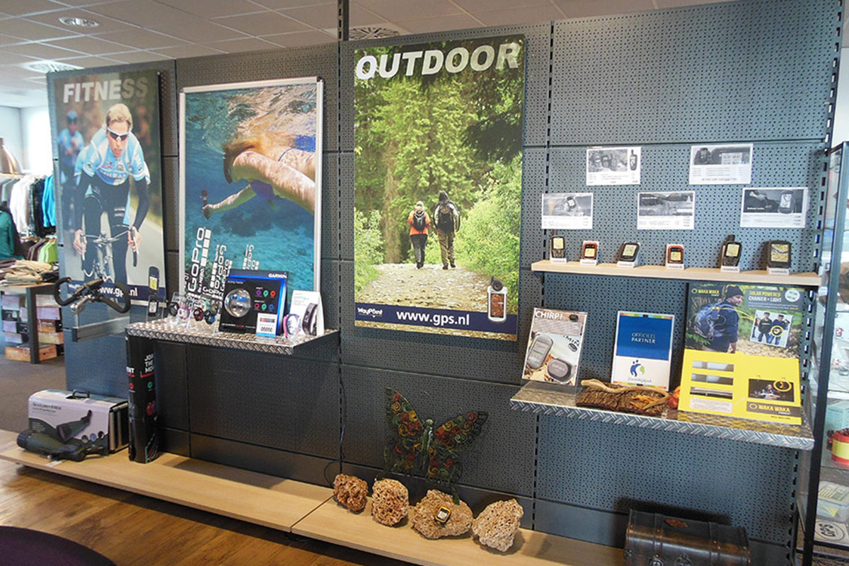
Nudging literally means giving a gentle nudge in the right direction. The principle comes from behavioral psychology and revolves around subtly influencing choices without forcing people to do anything.
A well-known example is the small fly that was placed in urinals at Amsterdam Airport Schiphol. Men automatically aimed better, resulting in a significant reduction in cleaning costs. A minimal visual cue proved to be enough to immediately change behavior.
You also see nudging everywhere in stores. Think of products at eye level, eye-catching displays along walking paths, or repeated brand messages in a showroom. Often, consumers don’t even realize that their attention is being consciously steered.
The human brain constantly tries to conserve energy. That’s why people make many decisions automatically, without thinking them through extensively.
In a retail environment, this happens constantly. Shoppers first scan colors, shapes, and contrasts before reading prices or product information. First impressions are often formed within just a few seconds.
That is precisely why retailers are investing more and more in smart in-store communication and visual presentation. Clear signage, recognizable branding, and well-organized displays make information easier to process. The less effort it takes to make choices, the more likely consumers are to take action.
Design has a significant impact on how consumers perceive products and brands. It determines whether something feels friendly, luxurious, reliable, or eye-catching.
Rounded shapes are usually associated with accessibility and safety. That’s why many consumer brands use rounded shapes in packaging, logos, and displays. In contrast, clean lines and angular shapes feel more powerful and exclusive.
Size also plays an important role. Large visuals and eye-catching displays automatically attract more attention. Products presented on a larger scale feel more important and valuable.
Color further enhances that effect. Red evokes a sense of urgency and prompts action, while blue conveys trust. Green is often linked to sustainability and health. Research shows that color plays a major role in brand recognition and first impressions.
In neuromarketing, there is extensive research into how visual stimuli influence the brain. Shape, contrast, and color have been shown to have a direct effect on attention and emotion, often before consumers are even aware of it.
Where a product or message is placed largely determines how much attention it receives. Products at eye level are noticed more quickly and purchased more often than products at the bottom of a shelf.
Supermarkets have been using this principle for years. A-brands are often placed in the center of the shelf, while impulse purchases are deliberately placed near the checkout. Children’s products are also strategically placed at children’s eye level.
It’s not just shelf layout that plays a role here. Customer flow also strongly influences behavior. In stores, people often unconsciously follow set walking paths. As a result, the layout of a space determines which products are seen and remembered.
At trade shows and in showrooms, this works exactly the same way. Visitors automatically respond to sightlines, open spaces, and visual focal points. Smart placement directs attention without visitors consciously realizing it.
How does repetition work in marketing?
Repetition fosters recognition and trust. The more often people see a brand, design, or message, the more familiar it feels. This psychological principle is known as the mere exposure effect.
Even when consumers aren’t consciously paying attention, the brain remembers colors, logos, shapes, and slogans. That’s why strong brands invest heavily in consistent branding and recognizable visual communication.
In retail environments, this is reflected in the consistent use of colors, recognizable store displays, and standard visual elements. Consistent repetition not only increases brand recognition, but also reinforces trust and purchase intent.
Repetition also plays an important role online. Think of retargeting ads, recurring campaigns, and recognizable call-to-action elements in online stores. The more often consumers encounter a brand, the more likely they are to remember and trust it.
Retailers use various techniques to subtly influence attention and purchasing behavior. Displays play a key role in this.
A well-placed floor display along a busy walkway immediately grabs attention. Shelf stoppers help products stand out on crowded shelves, while lighting automatically draws focus to specific items.
Trade show booths also make clever use of nudging. Large visuals, open layouts, and clear focal points ensure that visitors stop more quickly and take in information. By cleverly combining contrast, changes in height, and lighting, more interaction is created on the trade show floor.
In addition, retailers often use social proof. Products labeled as popular or top picks automatically feel more trustworthy. Scarcity also strongly influences behavior. Messages such as “only a few left” increase urgency and trigger FOMO—the fear of missing out.
Nudging goes beyond just visual communication. The senses also have a significant influence on purchasing behavior and brand perception.
Scent marketing, for example, is widely used in retail and hospitality. The smell of fresh bread in a supermarket stimulates the appetite and increases the likelihood of purchases. Stores and hotels are increasingly using recognizable scents to strengthen brand recall.
Music also influences behavior. Slow music encourages visitors to stay in a store longer, while calm background music creates a relaxed atmosphere.
Lighting also plays an important role. Warm lighting feels inviting and creates a cozy atmosphere, while bright light enhances focus and attention. That’s why retailers use different light intensities for premium products, promotions, or new collections.
Online nudging is getting smarter all the time. Online stores continuously analyze how visitors click, scroll, and navigate. Small adjustments can make a big difference in conversion rates and user experience.
Eye-catching call-to-action buttons, product recommendations, and smart product sequencing subconsciously guide visitors toward a purchase. Free shipping on orders over a certain amount and countdown timers also increase the likelihood of conversion.
Simplicity also plays a major role online. The fewer steps a user has to take, the greater the chance that an order will be completed. That’s why fast checkouts and clear navigation are so effective.
Companies use techniques such as heat maps and A/B testing for this purpose. These tools are used to precisely determine which shapes, colors, and positions yield the best results.
Nudging becomes manipulative when consumers are deliberately misled or pressured. Examples include hidden costs, misleading buttons, or subscriptions that are difficult to cancel. These are also known as “dark patterns.”
Good nudging, on the other hand, helps users make choices faster and more easily. It improves ease of use, clarity, and the customer experience without taking away freedom of choice. Retailers and brands have an important responsibility in this regard. Effective behavioral influence isn’t just about sales; trust and user-friendliness also play a key role.
Cleverly designed standard displays do much more than just showcase products. They guide attention, customer flow, and interaction on the sales floor.
An effective presentation starts with a clear visual hierarchy. Key products should be immediately visible, while a sense of calm and simplicity helps customers process information more quickly. Overcrowded displays, on the other hand, cause decision fatigue and reduce attention.
The choice of materials also plays a role. Glossy surfaces attract attention more quickly, while natural materials convey a sense of calm and sustainability. Through the smart use of shape, lighting, and positioning, a presentation is created that automatically guides consumers toward a product or promotion.
As a result, it’s becoming increasingly important for brands to design display materials that are aesthetically pleasing, strategic, and psychologically savvy.
Consumers process enormous amounts of information every day. Attention has become a scarce resource. As a result, small visual details are making an increasingly significant difference.
These days, retailers don’t just compete on price or product quality. Attention and experience play an increasingly important role. Shape, color, placement, and repetition are increasingly determining which products are seen and remembered.
Cleverly applied nudging helps brands stand out faster, communicate more effectively, and make a greater impact on the sales floor.
This offers enormous opportunities for retail, trade shows, and point-of-sale communication. After all, a strong presentation not only sells a product but also subconsciously influences behavior.
What is nudging in retail?
Nudging in retail refers to subtly influencing purchasing behavior through product presentation, customer flow, displays, use of color, and visual communication.
Why does product placement work so well?
Products that are visible and strategically placed attract attention more quickly. Eye level and customer flow paths therefore have a major impact on sales results.
How does repetition influence consumer behavior?
Repetition fosters recognition and trust. The more often consumers see a brand or message, the more trustworthy it feels.
What is the difference between nudging and manipulation?
With nudging, consumers retain complete freedom of choice. Manipulation occurs when people are deliberately misled or pressured.
Why are displays important for nudging?
Displays attract attention, guide foot traffic, and make products more visible. As a result, they directly influence purchasing behavior and brand perception.
At Dutch Display, we understand how important attention and the shopping experience are on the sales floor. With custom displays, POS materials, and smart presentations, we help brands be visible at just the right moment. From retail stores and showrooms to trade shows and events, we develop display solutions that not only stand out but also contribute to customer flow, brand experience, and purchasing behavior. This creates a presentation that perfectly aligns with the consumer’s decision-making moment.
Would you like to learn more about this?
Customers often decide within seconds what a store feels like. Even before they look at a product, the atmosphere, layout, lighting, and product presentation already play a major role. That is exactly what the psychology behind store design is all about.
Smart store design not only makes a store look attractive but also influences purchasing behavior. It determines where customers look, how long they stay, and which products stand out. Even small choices in layout can impact the customer experience, sales, and revenue.
Anyone who understands how people look and move sees store design as much more than just decoration. It’s a powerful tool for directing attention, showcasing products more effectively, and improving the customer journey.
Table of Contents
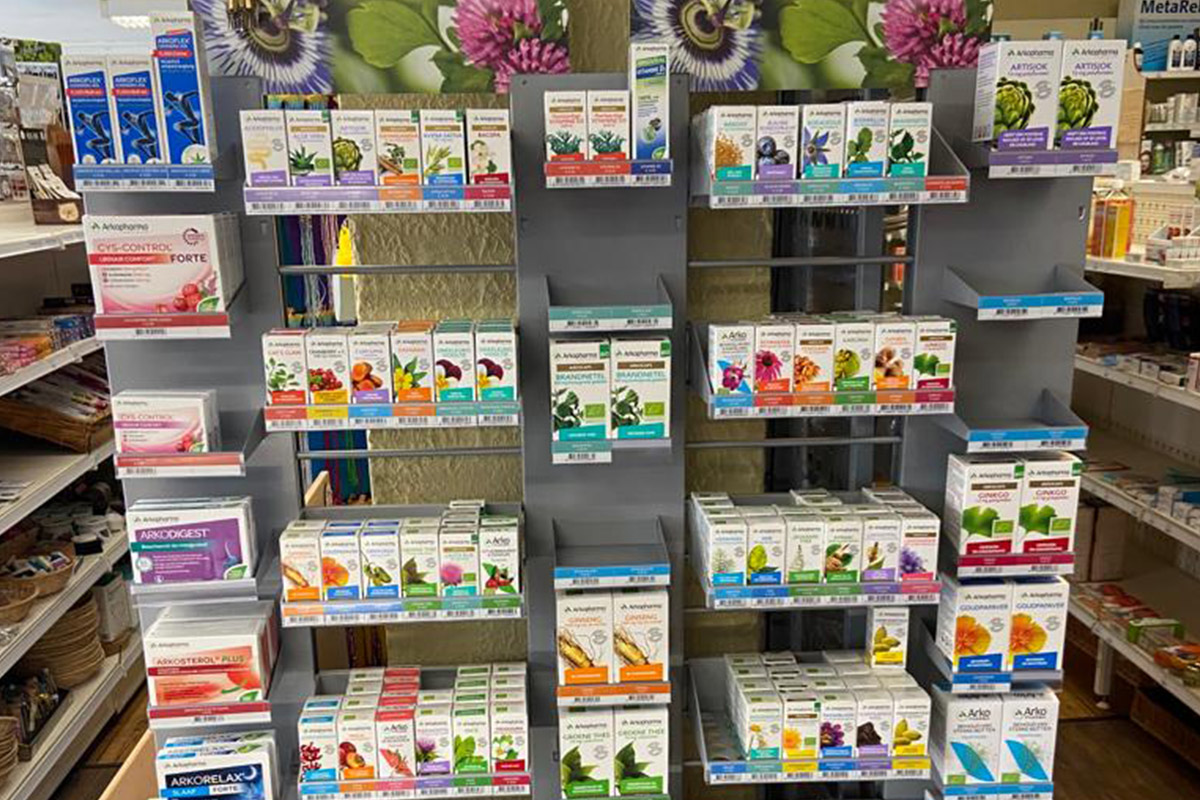
Retail design refers to the overall layout and presentation of a retail space. This includes customer flow, shelving, displays, lighting, colors, materials, and product presentation.
A well-designed retail space helps customers to:
People react strongly to visual stimuli. The brain often processes atmosphere, color, and texture faster than words. That’s why a store’s ambiance directly determines how trustworthy, luxurious, or appealing a brand feels.
A cluttered store is more likely to create a sense of unease. A well-organized retail environment, on the other hand, instills confidence and a sense of calm.
Interesting fact: Customers are more likely to touch products in a calm and well-organized store. Products that are touched are subsequently purchased more often.
First impressions are often formed within seconds. Customers automatically notice the lighting, colors, space, and overall layout. Even before someone touches a product, they’ve already formed an impression of the store.
An open and well-organized store layout often results in:
That’s why luxury stores often use plenty of space, calm colors, and minimalist displays. Discount stores, on the other hand, tend to opt for packed shelves and lots of promotional messaging.
Interesting fact: People subconsciously associate symmetry and order with quality and reliability.
Why is the shopping route in a store so important?
The customer flow determines which products customers see and how they move through the store. Smart routing ensures that visitors automatically pass by key products.
Many stores deliberately capitalize on viewing behavior. Upon entering, customers often head to the right first and then move clockwise through the store. That’s why new collections, promotions, and popular products are regularly placed on the right side.
A well-thought-out store layout helps to:
Major retailers make clever use of this. At IKEA, for example, customers are deliberately guided past various home furnishings displays. As a result, visitors discover more products than they originally intended to buy.
Supermarkets also apply this psychology. Fresh products such as vegetables, fruit, and bread are often placed near the entrance because freshness immediately evokes a sense of quality.
Colors, scents, and lighting have a direct impact on atmosphere and purchasing behavior. They determine how a store feels and what emotions arise while shopping.
Colors evoke different feelings:
For example, fast-food chains often use red and yellow because these colors evoke energy and speed.
Lighting determines where customers look and how products are perceived. With the right lighting, stores can make products stand out while also adding ambiance to the space. For example, spotlights are often used to highlight best-selling products, while warm lighting creates a cozy and inviting atmosphere. Accent lighting helps draw more attention to displays, and bright lighting is frequently used for promotional items. Interesting fact: products under poor lighting are often perceived as less valuable.
Scent has a strong influence on emotions and memories. A pleasant scent makes customers’ shopping experience more enjoyable and encourages them to browse longer.
That’s why many retailers use subtle scent marketing to enhance the atmosphere and brand experience.
A smart store layout influences how long customers stay. The longer someone takes their time browsing, the greater the chance of additional purchases.
That’s why stores use elements that create a sense of comfort and inspiration, such as:
Mirrors, seating areas, and natural materials can also contribute to a pleasant shopping experience.
Retail research consistently shows that customers spend more when they feel relaxed in a store environment.
Especially now that online shopping is becoming easier, the in-store experience plays an even greater role. Stores must not only showcase products to customers, but also inspire and surprise them.
Displays play a major role in store design. They draw attention and add value to products.
A product sitting alone on a shelf receives less attention than the same product in a compelling display. Effective displays ensure:
Displays make a big difference, especially for promotions, new collections, and seasonal products.
POS displays also help draw extra attention to products in places where customers make purchasing decisions.
In fashion stores, product presentation often revolves around atmosphere and styling. In electronics stores, on the other hand, the focus is on clarity and product information. Each industry therefore requires a different approach to retail design.
Too many stimuli lead to choice overload. When customers see too many products at once, it becomes harder to make decisions. This psychological effect is known as choice overload. A calm store environment therefore helps create a clearer overview, makes products more visible, and enables customers to make decisions more quickly.
This also makes it easier to encourage impulse purchases. Minimalist displays are particularly effective for luxury products and premium brands. An interesting detail: products placed at eye level typically sell better than those placed lower or higher.
Many stores unknowingly miss out on sales opportunities due to unclear or cluttered layouts.
Common mistakes include:
A crowded store, in particular, can overwhelm customers more quickly. Displaying fewer products often results in more attention being paid to each individual item.
Every industry requires a different design and shopping experience. A clothing store often focuses on inspiration, atmosphere, and styling. That’s why collections are presented as complete looks with mood lighting and eye-catching displays.
A home furnishings store, on the other hand, is all about the experience and spatial inspiration. Products are often placed in complete settings so customers can better visualize how furniture and accessories will look in their homes.
At drugstores and supermarkets, the focus is more on clarity, speed, and clear navigation. Customers want to be able to find products quickly there.
A successful store layout therefore always aligns with the purchasing behavior of the target audience.
A strong in-store experience feels like an extension of the brand. The store’s atmosphere must align with the target audience, products, and the company’s image.
A luxury brand often opts for:
A creative or young brand, on the other hand, tends to use:
When store design and brand identity work well together, they create a recognizable shopping experience that customers remember.
How does store design influence purchasing behavior?
Store design guides attention, customer flow, and atmosphere. As a result, customers stay in the store longer and discover more products.
Why is lighting so important in a store?
Lighting sets the mood, improves visibility, and creates focus. Good lighting makes products more appealing and enhances the perception of quality.
Which colors work well in store design?
That depends on the brand and the target audience. Colors such as black, white, green, blue, and red are widely used because of their psychological impact.
Why do stores place products at eye level?
Products at eye level are noticed more quickly and purchased more often.
What is visual merchandising?
Visual merchandising is the attractive presentation of products to boost sales and enhance the brand experience.
Why do stores use designated walking routes?
Walking routes ensure that customers pass by more products and stay in the store longer.
Store design actively shapes how customers look, move, and make decisions. With the right customer flow, lighting, displays, and product presentation, you can create a shopping experience that fosters calm, focus, and trust. It is precisely this combination that makes products stand out more and keeps customers engaged longer. Dutch Display helps brands and retailers design store spaces more intelligently with displays and presentations that are not only visually striking but also contribute to sales, brand perception, and consumer behavior. Feel free to contact us for advice.
A storefront window is much more than just a window at the front of a store. It’s the first impression of your business, your brand’s calling card, and often the first point of contact with a potential customer. People walking past a store usually look at the window first and only then decide whether it’s worth going inside.
That’s precisely why the storefront plays a bigger role today than ever before. Consumers are bombarded with hundreds of stimuli every day, and online stores are always just a click away. A brick-and-mortar store must therefore immediately make it clear why someone should stop right there. A good storefront does exactly that: it grabs attention, sparks curiosity, conveys atmosphere, and puts products in the spotlight—both literally and figuratively.
For Dutch Display, this is part of our daily work. After all, a strong window display presentation starts not only with beautiful products, but also with the right layout, clear visual communication, and smart presentation tools. In this blog, you’ll learn exactly what a window display is, what function it serves today, and why a well-thought-out window display remains a powerful component of successful retail.
Table of Contents
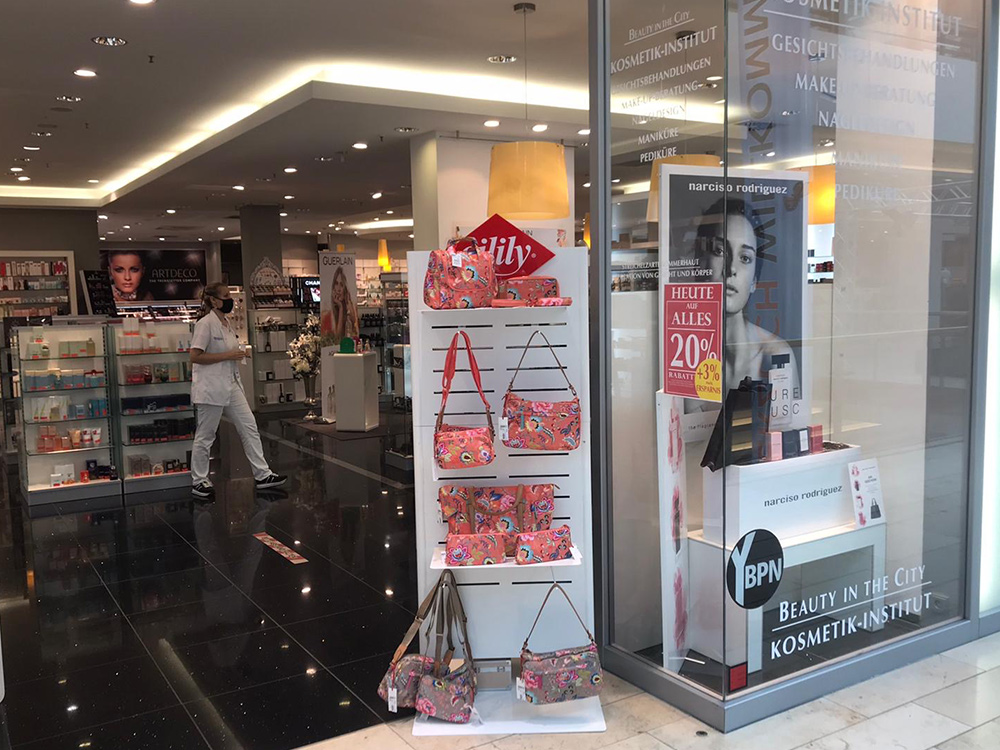
A storefront window is the visible display area at the front of a store where products, ambiance, seasonal items, promotions, or brand messaging are showcased. The goal is clear: to attract the attention of passersby and entice them to step inside the store.
In practice, a storefront window is a combination of product presentation, visual merchandising, and store communication. In just a few seconds, it conveys what kind of store this is, what style or price range it offers, and what type of customer the selection is intended for.
This makes the storefront an important part of the overall shopping experience. Even before a customer speaks to a staff member or touches a product, the storefront has already told an initial story.
A storefront is still important because brick-and-mortar stores compete for attention every day—not only with other stores, but also with smartphones, online ads, social media, and hurried passersby. If you don’t make an impression in those few seconds, people will simply walk right past you.
You can think of the storefront as the “homepage” of the physical store. Just as online shops attract customers with landing pages and product photos, the storefront does the same on the shopping street. It must immediately make clear what you’re selling, what kind of atmosphere you’re creating, and why someone should choose to step inside your store.
In addition, a storefront helps a business stand out. Especially in busy shopping districts, an eye-catching storefront or inspiring product display ensures that a store is more easily remembered. This not only increases the likelihood of an immediate store visit but also strengthens brand recognition in the long term.
The modern storefront fulfills multiple functions simultaneously. It’s not just a place to display merchandise, but an active component of marketing, branding, and sales.
First and foremost, a storefront must make people stop. A strong display slows down passersby, catches the eye, and increases the likelihood that someone will actually walk inside. That ability to draw people in is invaluable in busy shopping districts.
In addition, the storefront directly communicates what a store stands for. A minimalist display exudes calm and luxury, while a colorful and playful arrangement can come across as approachable and energetic. Sustainable materials, natural colors, and clear signage also contribute to the image a store conveys.
Furthermore, presentation influences the perceived value of products. Items that are well-lit and carefully displayed appear more attractive and exclusive. A storefront window thus not only attracts attention but also strengthens the intention to buy.
Finally, the storefront window is a means of communication. It can announce a new collection, highlight a promotion, showcase a season, or inform visitors about a temporary campaign. As such, the storefront window serves as both a display, a source of information, and a brand ambassador.
Not every storefront serves the same purpose. The appropriate design depends on the type of store, the target audience, and the goal of the display.
An open storefront offers a view into the store itself. Customers can look inside through the window and immediately get a sense of the space, atmosphere, and foot traffic in the store. This creates a sense of transparency and accessibility.
A closed storefront uses a back wall or defined background. This allows for greater control over lighting, color, and composition. This type of storefront is often used for thematic displays or luxury product presentations.
A thematic window display revolves around a story. Think of spring, Christmas, Mother’s Day, vacation, sustainability, or an anniversary campaign. The goal is to immediately convey a season, feeling, or atmosphere.
A promotion-focused window display is primarily aimed at price communication and promotions. This style is suitable for sale periods, limited-time promotions, bundle offers, or seasonal clearance sales.
A brand-focused window display sells not only products, but above all a feeling or identity. This type of presentation is common in fashion boutiques, luxury stores, and concept stores.
A successful storefront display is clear, attractive, and purposeful. It doesn’t have to be busy or complicated to stand out. On the contrary: simplicity often works better.
A strong focal point is essential. The window display must immediately show where the eye should go. This could be a single product, an eye-catching object, a mannequin, or a central message. Without a focal point, the presentation quickly loses its impact.
Lighting also plays a major role. Good lighting makes products more appealing, enhances contrast, and helps create depth and atmosphere. This is especially essential in the fall and winter.
In addition, simplicity often works better than excess. An overcrowded window display makes it difficult to grasp the message quickly. By opting for space, hierarchy, and clear focal points, the presentation becomes stronger.
Timeliness is just as important. A window display that remains the same for too long becomes less noticeable over time. Regular updates ensure timeliness, repeat visits, and a vibrant store image.
Finally, presentation materials make a big difference. Displays, card holders, price tags, signage holders, pedestals, poster frames, and other presentation tools provide structure and a professional look. They make the difference between a cluttered storefront and a well-curated window display.
Many window displays lose their impact due to a few recurring mistakes. That’s a shame, because these mistakes are often easy to avoid.
A common mistake is including too much information. Too many products, texts, colors, or price information create a sense of clutter. As a result, it’s no longer clear what the visitor is actually supposed to see.
An outdated or poorly maintained window display also detracts from the store’s image. A dusty storefront window, crooked signage, broken lighting, or a display that no longer matches the season quickly gives the impression that the store is less active or less well-maintained.
In addition, the storefront must align with what customers find inside. When the exterior appearance doesn’t match the in-store experience, it leads to disappointment. The storefront must therefore provide an honest and appealing preview of what visitors can expect.
Finally, readability is often underestimated. Text, promotional signs, and pricing information must be clear at a glance. This requires sufficient contrast, a clear font size, and logical placement.
Today, the storefront is not just a physical display, but also a link between offline and online visibility. Stores are increasingly operating on an omnichannel basis. This means that customers move effortlessly between the high street, the online store, and social media.
A modern storefront can capitalize on this by featuring references to a campaign, a QR code, a social media account, or click-and-collect information. An eye-catching storefront that people photograph and share on Instagram or TikTok also expands the store’s reach.
This gives the storefront a dual function. It works locally on the street and digitally through shared images and recognizable brand messaging. For retailers, this is an opportunity to extend physical visibility into an online brand experience.
A storefront is important for brand experience because atmosphere often makes an impression before information does. Customers immediately sense whether a store suits them. That feeling arises from visual choices such as color palette, materials, composition, typography, and presentation style.
A luxury brand often opts for tranquility, space, and high-quality finishes. An accessible store is more likely to use recognizable promotions, warm colors, and clear communication. A sustainable retailer may work with natural tones, reusable materials, and authentic product stories.
All of these choices together shape the brand’s image. The storefront is therefore not a standalone element, but an important part of the store’s overall identity.
A strong storefront means more than just a well-maintained storefront. It helps attract attention, appeal to the right customers, reinforce the brand identity, and present products in a compelling way. In many cases, the storefront is the first—and perhaps most important—point of sale for a brick-and-mortar store.
That’s precisely why it pays to invest in professional store presentation. With the right displays, holders, communication tools, and visual support, you can make the leap from simply being visible to truly standing out.
At Dutch Display, we know how important that first impression is. A storefront must look attractive, communicate clearly, inspire, and motivate. Those who get this right turn the storefront window into a powerful extension of the sales floor.
Do storefront displays still attract customers inside?
Yes. A well-designed storefront display increases the likelihood that people will slow down, look, and ultimately step inside the store. This ability to draw people in is especially crucial on shopping streets with a lot of competition.
Does a storefront display convey what a store stands for?
Absolutely. The look and feel of a storefront window directly communicates a store’s identity. Style, materials, colors, and layout all work together to determine how a brand is perceived.
Can a storefront window help sell products more effectively?
Yes. Presentation influences the perceived value of a product. Items that are well-lit and neatly displayed look more attractive and exclusive.
Is a storefront also a means of communication?
Definitely. A storefront can highlight a promotion, new product line, campaign, or seasonal event, thereby quickly conveying information to passersby.
How does a storefront influence purchasing behavior?
People make decisions largely based on visual cues. Color, contrast, lighting, simplicity, and composition determine in a fraction of a second whether something catches the eye and invites action.
What essential elements are often overlooked?
The target audience, maintenance, seasonal planning, and a clear objective behind the display are often underestimated. It is precisely these practical fundamentals that determine how effective a storefront display ultimately is.
Has the shop window been around for centuries?
Yes. Retailers have been displaying their merchandise on the street side for a very long time. The modern shop window took on added significance with the emergence of large glass storefronts and urban shopping streets.
Is the word “shop window” also used figuratively?
Yes. For example, we say that someone or something is “in the window” when it is made visible to a wide audience.
Are holidays important for store windows?
Definitely. Around Christmas, spring, vacation periods, back-to-school season, and other peak sales times, store windows often receive extra attention. These are times when customers are particularly receptive to atmosphere and new ideas.
Can store windows attract tourists?
Yes. Well-known department stores and flagship stores are sometimes visited specifically for their unique store windows. In some cities, festive store windows are even a major attraction.
Do bakeries or specialty shops also benefit from a strong storefront display?
Absolutely. Shops with visually appealing products—such as bread, pastries, chocolate, flowers, home decor, or gifts—benefit greatly from an inviting presentation.
A store window is often the first thing passersby see when they walk by a store. In just a few seconds, they form an impression of the atmosphere, the products, and the store’s overall appeal. That’s precisely why a store window isn’t just decoration—it’s a key part of how you attract attention and entice people to step inside.
Table of Contents
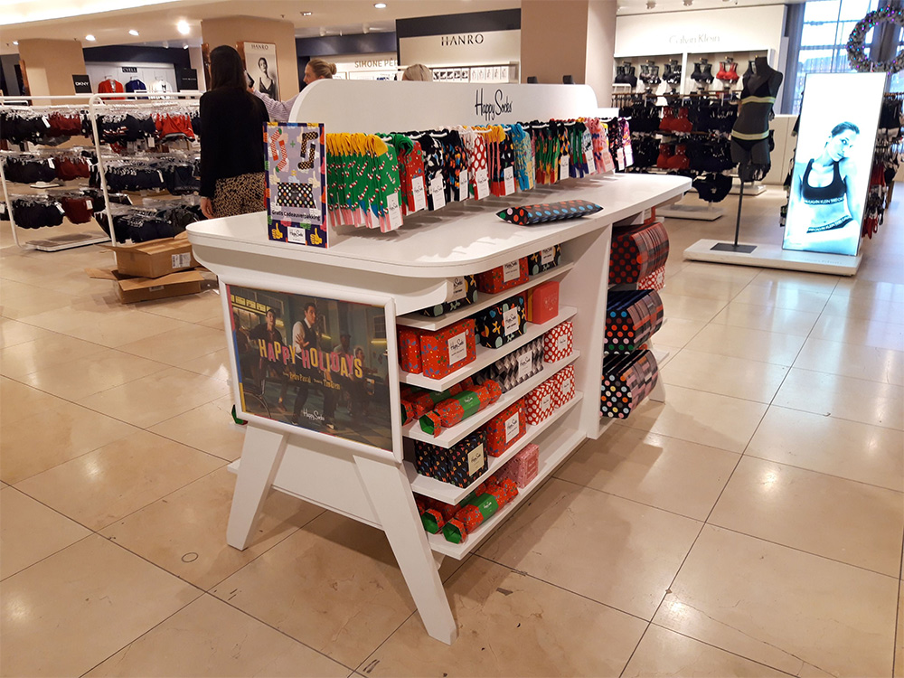
Designing a storefront seems simple. You display a few attractive products, add some ambiance, and wait for passersby to stop. In practice, it works differently. A storefront doesn’t automatically attract attention just because it contains products. People walk by, glance briefly, and decide within a few seconds whether your store is interesting enough to approach.
That’s precisely why a good storefront display is more than just a neat presentation. The storefront is the first visible point of contact between your store and passersby. Even before someone steps inside, they’ve already formed an impression of your style, price range, quality, and brand. A strong storefront display helps you stand out on the shopping street, spark curiosity, and lower the barrier to entry.
So, when you design a storefront display well, you’re not just showcasing products. You’re also showing why your store is worth visiting.
Passersby rarely look at a storefront while standing still. The first glance almost always happens while they’re moving. This means people first scan the storefront and only then take a closer look. In those first few seconds, they primarily react to contrast, shape, light, calmness, and a clear focal point.
That’s important to keep in mind when designing a store window. Many stores try to convey everything at once. The new collection, sale prices, atmosphere, product range, and brand story all need to be visible simultaneously. This makes the store window look cluttered and dilutes the core message.
A storefront is more effective if you first grab attention and then provide information. First, someone needs to get the sense that there’s something interesting to see. Only then does space open up to look at prices, products, or details.
What a Good Storefront Makes Immediately Clear
A good storefront doesn’t have to show everything. Above all, it must quickly make it clear what a passerby is looking at. What kind of store is this, what’s the atmosphere here, and is this relevant to me? These are the questions a passerby subconsciously answers.
A luxury boutique often relies on tranquility, space, and a limited number of products. A gift shop tends to focus on seasonal themes, color, and instantly recognizable gifts. A bakery, on the other hand, wins customers over with freshness, warmth, and an attractive presentation of a few standout products. An interior design store is more likely to draw attention with materials, composition, and style.
That’s why window display design is never a one-size-fits-all approach. The right design depends on your store, target audience, location, and goal. Still, there are clear principles that almost always work.
Designing a smart window display starts with making choices. Not everything needs to be on display. In fact, selecting the right products and creating a clear layout are what make your storefront stand out.
Every strong storefront display has an eye-catcher. This could be a product, a mannequin, a striking object, a promotional sign, or a thematic element. The focal point is the first thing to catch the eye and gives direction to the rest of the display.
Without a focal point, the eye wanders. Passersby may see a lot, but they’ll remember little. With a clear focal point, the window display becomes calmer, more impactful, and easier to take in at a glance.
A store window becomes more impactful when it has a sense of cohesion. You can achieve this by working with a clear theme. Think of spring, holidays, sales, a new collection, sustainable living, back-to-school, or summer in the city. A theme helps you group products logically and makes the display more appealing to look at.
A good story doesn’t have to be complicated. Even a small storefront display can be highly effective if the colors, product selection, and atmosphere all work together.
A flat storefront display can quickly look boring. When all products are at the same height, the display lacks visual interest. Using pedestals, stands, hanging points, or platforms creates more dynamism. This makes the display more appealing and helps guide the viewer’s gaze more effectively.
Differences in height also add value to the presentation. A product displayed on its own with space around it automatically attracts more attention than an item that gets lost in a crowded display.
Eye level remains one of the most important spots in a storefront window. Products or messages placed there stand out more quickly. This applies to hero products as well as important pricing information or a brief promotional message.
Items placed too low are less noticeable. Items placed too high require too much effort to see. A smart window display design therefore takes sightlines and the direction of foot traffic into account.
A window display is not a brochure. Long texts usually don’t work well outdoors. People are walking, glance briefly, and make quick decisions. Therefore, opt for short messages, clear words, and visual simplicity.
A price tag, promotional text, or short sentence can work perfectly well, as long as it’s immediately readable. As soon as there’s too much text, different fonts, or multiple messages visible at once, the window display loses its impact.
Many window displays lose their impact due to a few recurring mistakes. The good news is that these are usually easy to avoid.
A crowded storefront may seem appealing, but it often backfires. When everything is vying for attention, nothing really gets noticed. A selection of a few standout products usually works better than a complete overview of the entire product line.
Sometimes products, props, colors, and text appear disjointed in the store window. In such cases, the narrative is missing. Passersby see isolated elements rather than a cohesive presentation. This makes the store window look cluttered and less compelling.
Price communication is important, especially during sales. However, text should support the window display, not overshadow it. When price tags dominate, the atmosphere is lost, and the store looks cheap rather than attractive.
A window display that remains unchanged for weeks loses its ability to capture attention. Regular passersby, in particular, stop consciously noticing it over time. Regular updates ensure freshness, relevance, and renewed attention.
The window display sets expectations. When the atmosphere outside doesn’t match what someone finds inside, disappointment ensues. A good window display, therefore, aligns with the store’s interior design, customer flow, and product presentation.
Lighting is one of the most underrated aspects of window display design. Good lighting makes products more appealing, draws attention, and creates atmosphere. Without good lighting, a window display can quickly appear flat, dark, or lifeless.
With targeted lighting, you can draw extra attention to a featured product. Warm lighting helps build atmosphere. Sufficient contrast ensures that materials, colors, and shapes are more clearly visible. Storefront lighting is especially indispensable in the fall and winter.
Presentation materials also play a major role. Think of displays, pedestals, card holders, poster frames, price signage, and product holders. These elements provide structure, height, clarity, and a professional look. They help transform a haphazard arrangement into a polished window display.
That’s often precisely where the difference lies between a storefront that looks nice and one that really works. A strong presentation is created when products, materials, signage, and layout reinforce one another.
For stores that want to design a window display as an extension of their brand, it’s wise to consider not only the styling but also the practical elements that support the presentation. That’s where a window display often becomes stronger, more cohesive, and more compelling.
There’s no hard-and-fast rule for how often you should update a storefront display. It depends on your location, target audience, industry, and the number of passersby. Still, one rule almost always applies: the more visible your store is, the more important it is to update the display.
On a busy shopping street, it may make sense to update the display every two to four weeks. In other situations, a monthly or seasonal change may be sufficient. You don’t have to completely rebuild the entire window display every time. Even small changes can make a difference.
Consider:
By keeping your storefront up to date, you show that your store is vibrant. Not only does this attract more attention, but it also gives returning passersby another reason to take a look.
A strong storefront offers more than just a neat exterior. It increases your store’s visibility, reinforces the first impression, and boosts the chances of turning a passerby into a customer. That makes the storefront a crucial part of your store’s presentation and sales.
Specifically, a well-designed storefront can help to:
This means that, in addition to being decorative, a storefront window is an active part of your commercial image—especially when you use a well-thought-out combination of window displays, in-store communication, and displays that suit your space and goals.
Designing a storefront window is important because passersby decide within a few seconds whether your store is worth their attention. A good storefront window not only catches the eye but also immediately makes it clear what you’re selling, what kind of atmosphere you’re creating, and why someone should step inside. Those who design a storefront window smartly work with focus, calm, height, light, and cohesion. It’s precisely this combination that makes products stand out more, gives the presentation a stronger impact, and gives your store a better chance of turning a passerby into a customer.
A well-known phenomenon in physical environments is that a display initially stands out clearly but becomes less and less noticeable over time. The design is still fine, the message is still accurate, and yet attention wanes. This happens in virtually any environment where people return frequently.
This effect is not a matter of taste or coincidence. It is the result of habituation: a fundamental mechanism in how people perceive and filter information. Those who understand this mechanism view the commercial lifespan of a display differently.
Table of Contents
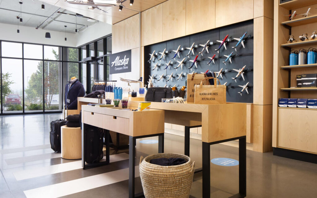
People are exposed to large amounts of visual information every day. To cope with this, the brain is constantly making choices. Stimuli that are familiar and do not add new meaning are given lower priority.
This process occurs gradually. First comes active attention, then recognition, and finally neutrality. The information has been processed and does not need to be reevaluated. This happens largely subconsciously. In physical environments, this means that a display that is seen more frequently is perceived less and less actively, even when the content remains relevant.
The result isn’t seen in conscious rejection, but in behavior. People walk by without looking, no longer take in the message, and respond less. The display is still there, but its contribution to attention and orientation diminishes.
Displays are often designed with consistency as a guiding principle. This makes sense, because recognition aids understanding and builds trust. However, that same consistency also causes the brain to quickly classify a display as familiar.
In practice, habituation is particularly reinforced when several fixed elements come together:
Each of these choices is justifiable. The effect arises because they are combined and remain virtually unchanged. To the brain, this is a clear signal that paying further attention will yield little benefit.
The difference between new and returning visitors makes this effect apparent. Someone entering an environment for the first time actively scans it. Their gaze searches for landmarks, anomalies, and cues that help them understand what’s going on there. In that phase, a display serves a clear function as an attention-grabber and source of information.
For returning visitors, that viewing behavior shifts. They are familiar with the space, the walking routes, and the fixed elements. What remains unchanged is filtered out more quickly. Their gaze focuses less on confirmation and more on deviation. Only what is visibly different still demands attention. A display that remains the same in terms of visuals and content loses its role in this phase—not because it is bad, but because it has become predictable.
However, many displays are used as if every visitor were constantly in the first phase. This ensures that they continue to function technically, while their commercial effectiveness declines.
A display can technically last for years without any problems. The materials remain intact, the colors stay vibrant, and the structure remains stable. But that says little about its commercial lifespan.
Commercially, it’s all about visibility and relevance. As soon as a display is noticed less, its impact diminishes. This often happens well before there’s any technical issue. In that sense, habituation isn’t a sign of wear and tear, but of a diminished impact.
This explains why displays are sometimes replaced even though they’re still in good physical condition. Not because they’re broken, but because they’ve outlived their purpose in that environment.
In a drugstore, a floor display was used for a seasonal promotion. In the first few weeks, it clearly attracted attention and was actively used to help customers find their way around. After a few months, the display remained in the same spot, with the same message. The product and the design didn’t change, but regular customers increasingly walked past it without looking. Visibility declined, while the display’s technical condition remained unchanged.
A similar pattern can be observed at recurring trade shows. A booth element that stands out in its first year due to its size and positioning loses its impact with repeated participation. Visitors recognize the design and immediately commit it to memory. The element of surprise disappears, and attention shifts to other stimuli that are actually new.
In both situations, the cause lies not in quality, but in repetition without adaptation.
You don’t break through habituation by adding more information or by making a more visually striking impression. That increases the stimulus, but doesn’t change recognition. What does work is targeted change that reactivates the viewing pattern.
In practice, this means paying attention to timing and variation:
These changes don’t have to be major. The goal isn’t to create surprise for the sake of surprise, but to restore relevance for people who are already familiar with the environment.
A display functions differently in different phases. At first, it aids orientation. Then, recognition helps users look at it efficiently. After that, attention wanes. Those who take these phases into account in advance can make choices that delay habituation.
This doesn’t require additional resources, but it does require insight into usage duration, transition points, and context. By thinking about these factors in advance, the display’s commercial impact is sustained for longer.
The fact that a display becomes less noticeable over time is not a design flaw or a weakness of the medium. It is a logical consequence of how people perceive and filter information. Those who recognize this can also consciously steer the process.
At Dutch Display, we incorporate this insight into our design and consulting. By accounting for habituation, modular construction, and interchangeable communication layers, we ensure that attention is sustained longer—across various environments and applications.
If you’d like to know how this applies to your situation, a consultation is often the best first step.
The term “POS display” is widely used but rarely clearly defined. It often refers to a display located near a shelf or at the checkout. In practice, that definition is too narrow. A POS display is not defined by where it is located, but by when it is used.
POS stands for Point of Sale: the moment when a choice is made. A POS display supports that decision-making moment—not by providing extensive information or telling a brand story, but by offering guidance just as someone is about to make a decision.
Anyone who treats a POS display as a general store display or a scaled-down trade show booth is using it for a purpose for which it was not intended.
Table of Contents
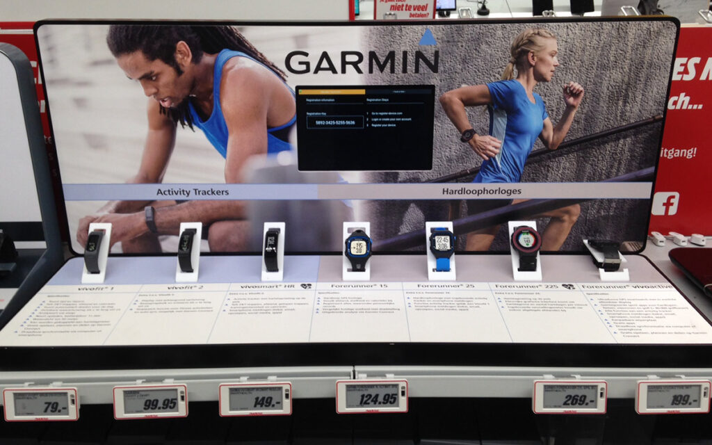
A POS display is a communication tool used at or immediately around the moment of decision. That moment of decision can be a purchase, but it can also be a choice regarding a service, option, route, or next step.
The distinction lies not in format or material, but in function. A POS display operates at close range, over a short period of time, and with a clear focus. The message is always well-defined and supports an existing decision-making context.
In short: a POS display helps someone choose, not orient themselves.
The terms “POS display” and “in-store display” are often used interchangeably, but they fulfill different roles within the same environment.
An in-store display:
A POS-display:
A store display attracts attention.
A POS display turns that attention into a decision.
A POS display operates in an environment where there are already many distractions. Attention spans are limited, and decisions are often made quickly. This means that a POS display always has a clear, specific purpose.
In practice, POS displays are primarily used to:
What a POS display doesn’t do is provide detailed explanations or try to persuade customers. That’s not the right moment for that.
Although the core function remains the same, the decision-making moment looks different in each industry. That determines how a POS display is used.
These differences make it clear that a POS display is not a one-size-fits-all solution, but must always be tailored to the type of decision-making moment within the industry.
Because a POS display is viewed from a short distance and for a limited time, focus is crucial. Anything that doesn’t directly contribute to the decision works against it.
What does belong on a POS display:
For example:
What usually doesn’t belong here:
A POS display reinforces a decision that’s already been set in motion. It rarely initiates that decision on its own.
Not every spot in a space is suitable for a POS display. So ask yourself these questions:
If the answer leans more toward orientation, a POS display is usually not the right tool.
The physical form of a POS display supports its function. Because the interaction is brief, the display must be clearly organized and logically positioned. Material and construction determine how flexibly and durably the display can be used.
In environments where messages change frequently, adaptability is more important than a permanent look. In environments with static information, simplicity and a calm aesthetic can work better.
A POS display works when it:
It works less effectively when:
A POS display is not a one-size-fits-all display solution, but a targeted communication tool for the moment of decision. By closely examining its function, context, and industry, it becomes clear when a POS display adds value and when it does not.
Not sure whether your challenge calls for a POS display or a retail display? Start with the moment of decision, not the format.
The question of how long a display lasts is often answered based on the physical condition of the object. As long as a display isn’t broken, it’s assumed to still be usable. In practice, however, many displays lose their value before there’s anything technically wrong with them.
This is because a display always has two distinct lifespans: a technical lifespan, which determines how long the display physically functions, and a commercial lifespan, which determines how long the display actually contributes to visibility, attention, and interaction. These two rarely run in sync. Those who fail to make this distinction make decisions that seem logical at the time of delivery but prove disappointing during use.
This blog shows how technical and commercial lifespans evolve for different types of displays, and how that plays out in practice in environments such as retail, hospitality, healthcare, education, and events.
Table of Contents
Upon delivery, virtually all displays function properly. They are stable, look well-maintained, and do what they’re supposed to do. Their true lifespan only becomes apparent when the display becomes part of daily use or repeated deployment.
That moment varies by application. For a trade show display, it’s the moment when transport, setup, and takedown begin to repeat. For a retail display or POS display, it’s the moment when the display becomes part of a permanent environment and is continuously viewed, touched, and maintained.
Lifespan is therefore not a fixed value, but the result of use over time.
The technical lifespan of a display refers to the period during which the object remains structurally reliable. This is rarely determined by the primary material alone. In practice, technical wear and tear almost always occurs at the points where movement, stress, and repetition converge.
With repeated use, wear and tear tends to occur at:
A display may still be technically functional after multiple uses, but it will no longer operate smoothly. Assembly takes longer, minor adjustments become routine, and the display requires more attention to maintain its professional appearance.
Technical wear and tear rarely leads to immediate failure. The main effects are:
For a trade show display, this often becomes apparent after multiple transport cycles. For a retail display or POS display, it typically becomes apparent after prolonged use, cleaning, and daily contact with customers.
Commercial lifespan is not about the condition of the object, but about its effectiveness. A display can be technically sound and yet lose its function.
This happens when the display no longer contributes to visibility, recognition, or interaction.
How commercial obsolescence occurs
In practice, commercial wear and tear occurs due to:
With retail displays and POS displays, this often goes unnoticed. The display is still there, but it no longer sparks conversations or interaction. With trade show displays, commercial obsolescence occurs when the display no longer aligns with how visitors navigate the space or when its distinctive appeal fades.
Unlike technical wear and tear, commercial obsolescence cannot be measured by a defect. The display is still intact, but its impact is diminishing. As a result, the cause is often sought outside the display itself, while the problem actually lies in its diminished effectiveness.
In practice, these two lifespans almost never align. This leads to situations where a display still seems logical on paper but begins to cause issues in actual use.
Common scenarios include:
For example: A display is designed for long-term use and is structurally strong enough to last for several years. At the same time, the application requires regular updates to the message. Technically, the display can remain in place, but commercially, it quickly loses its effectiveness when that flexibility is lacking.
Lifespan of Trade Show Displays, Retail Displays, and POS Displays
The balance between technical and commercial lifespan varies by application.
For trade show displays, the emphasis is often on:
When it comes to in-store displays and POS displays, the focus is shifting to:
This means that the same display can have a different lifespan in different environments, even when the object itself is identical.
Distinguishing between technical and commercial lifespan helps you better assess the need for replacement.
Technical replacement makes sense when:
Commercial replacement makes sense when:
By considering these two aspects separately, a more realistic decision-making framework emerges.
Adaptability rarely extends the technical lifespan, but it can significantly extend the commercial lifespan. Consider interchangeable panels, modular construction, or the ability to adapt the layout to a new context.
Reusability is therefore not an automatic advantage. A display may be technically reusable, but commercially it may no longer align with the desired look or message. The reverse is also true: a strong message that can no longer be supported technically.
A display does not need to last as long as possible, but rather to remain effective for as long as possible within its application. By assessing technical and commercial lifespans separately, the conversation shifts from costs to return on investment over time.
This prevents choices that seem logical at the time of delivery but lose their value during use.
A display’s lifespan is not determined by material alone, nor by communication alone. Only when technical and commercial lifespans are considered together can we gain insight into what a display truly delivers.
That insight makes the difference between a display that remains in place and one that continues to function.
An effective display message isn’t created by adding more information, but by presenting information at the right moment. In practice, a display is rarely read all at once. At trade shows, in stores, and in showrooms, people move through the space and decide as they walk whether something is worth their attention.
This means that a display message is always perceived in stages. First, they determine whether it’s relevant; only then do they decide if it’s worth getting closer; and finally, they decide whether to take action. If you don’t take these stages into account when structuring the message, you run the risk of creating a display that’s technically sound but fails to communicate effectively.
The question, therefore, is not “What do we put on the display?” but “How do we construct an effective display message that works in practice?”
Table of Contents
Whether a display is at a trade show in the Netherlands, in a retail setting, or in a showroom, the way people look at it hardly changes. The context differs, but viewing behavior does not. When in motion, attention is limited. Only when at rest does space open up for content.
An effective display message takes this into account and always consists of multiple layers of information. Not as a theoretical model, but as a practical necessity.
The power lies not in the amount of information, but in how it’s distributed.
The first layer of an effective display message works from a distance. This moment is brief and often occurs while someone is walking, for example, along an exhibition aisle or through a store aisle. There’s no time for explanation.
At this level, it’s all about recognition. The visitor must be able to determine at a glance what the display is about and whether it might be relevant.
When this layer is well-designed, it leads to the only decision that matters here: stop or keep going.
Only when someone decides to get closer does the question change. No longer “What is this?”, but “What does this mean for me?”. This is the level at which the effective display message gains context.
In stores and showrooms, this is often the decisive moment. At trade shows, this layer determines whether a conversation begins.
Here, clarity is key—not comprehensiveness.
By structuring this information, the message remains understandable without oversimplifying it.
The third layer of an effective display message is intended for people who are already interested. This is the moment when providing more depth actually works, because the audience’s attention is now engaged.
Action arises at this level: a conversation, a question, a brochure, or a point of contact. Not because it’s forced upon them, but because the previous layers have done their job.
A display message may be substantively sound, but it still won’t work if the display medium doesn’t allow for layering. A single flat surface forces all the information together. A display with zones, depth, or modular elements makes it possible to physically separate the layers.
That is why the structure of the message must always be considered in conjunction with the shape, construction, and material of the display.
For fixed applications with few changes, a standard display can effectively convey a message. In situations where the message changes regularly, or where the same display is used in different environments, limitations arise. In such cases, the challenge isn’t the message itself, but the format into which it must fit.
An effective display message is created by working from the outside in. First, determine what someone should recognize from a distance. Next, determine what someone should understand up close. Only then do you add depth and call to action.
This sequence prevents explanations from coming too early and ensures that the message aligns with how people actually look and make decisions in stores, restaurants, healthcare settings, automotive showrooms, and other contexts where displays are used.
An effective display message doesn’t convince by saying more, but by saying the right thing at the right time. By consciously working with layers of information, you create a sense of calm, clarity, and ultimately, action. Want to learn more?
A display is often chosen based on its appearance and price. That’s understandable, but in practice, most problems don’t stem from how a display looks, but from how it’s used. Mistakes made during the design phase or in the selection of materials affect visibility, assembly, transportation, and lifespan.
What these mistakes have in common is that they are rarely immediately apparent upon delivery. They only become noticeable once a display is actually put into use: on the trade show floor, in a retail setting, or during repeated transport. This blog explains common mistakes made when choosing a display from the perspectives of construction, use, and practical application. It also clarifies the practical costs of these mistakes.
Table of Contents
A display may be visually striking and technically well-produced, but it may still fail to function adequately if viewing distance and sightlines are not explicitly taken into account. At a trade show or event, visitors rarely assess a display up close. The first impression is formed from a distance, often while moving and from an oblique angle.
When a design is evaluated on a screen or on paper, a distorted impression quickly arises. Text that appears legible on A4-sized paper loses its function at a distance of three to five meters. An image intended to be an eye-catcher fails to make an impact when its contrast, scale, or positioning are not tailored to the surroundings.
In addition, external factors such as lighting, differences in height, and other elements in the immediate surroundings play a role. Without taking these conditions into account, a display only becomes visible once someone is already standing in front of it, causing it to lose its function as an attention-grabber.
This mistake often occurs when:
Consequences in practice:
Reduced visibility, less attention-grabbing appeal, and a display that fails to fulfill its role in attracting visitors.
A low purchase price is often seen as an advantage, but says little about a display’s suitability for its intended use. The crux of this mistake is that price is disconnected from intended use. A display designed for temporary use behaves differently when used more frequently.
Repeated use leads to wear and tear, reduced stability, or limitations in adaptability. These are not manufacturing defects, but the result of a design that is not tailored to the intensity of use. These problems build up gradually and often only become apparent after multiple uses.
Typical causes:
Consequences in practice:
Replacement, repair, or modification in the short term, resulting in total costs that are higher than those associated with a higher initial investment better suited to the intended use.
Learn more about our standard displays and custom displays.
Displays are often judged based on their final appearance, not on the process leading up to it. However, transportation and setup are integral parts of their use. Weight, volume, and assembly sequence determine how much time and effort are required to get a display ready for use.
When these aspects are not taken into account, a situation arises in which a display is theoretically sound but practically impractical. Components may be heavy, difficult to handle, or assembled in an illogical manner. This leads to improvisation on site, which increases the risk of damage and prolongs setup time.
In addition, the human factor plays a role. A display that seems simple on paper can be complex in practice when it is assembled by different people.
This error occurs when:
Consequences in practice:
More time wasted, higher logistics costs, and an increased risk of errors or damage during setup and takedown.
Material selection is often based on appearance or a general notion of durability, but not always on how intensively a display will be used. In practice, the material determines not only how a display looks, but above all how it behaves during transport, setup, and repeated use.
Each material has specific properties that determine whether it is suitable for temporary or long-term use. When these properties are not explicitly taken into account, a mismatch arises between expectations and reality.
Broadly speaking, the following material choices can be distinguished for displays:
This error occurs when:
Consequences in practice:
Faster wear and tear or unnecessarily high investments without added functional value.
Many displays are designed for a single specific situation: a fixed stand size, a fixed message, or a single type of environment. That makes sense in and of itself. Problems arise when a display is later used more broadly, even though it is not technically prepared for that.
What starts as a display for a single application is later used in a different context. This reveals limitations that were not taken into account in the initial design.
Examples that illustrate this:
Signs that this issue is present:
Consequences in practice:
Limited flexibility and additional costs as soon as the application changes.
The costs of these errors rarely amount to a single large expense. They accumulate in the form of extra hours spent on setup, replacement of parts, repairs, and reduced visibility at crucial moments.
These costs are often spread out over time and are therefore less visible, but they do have a definite impact on a display’s return on investment.
Preventing these mistakes does not require complex solutions, but rather clear definitions established in advance. By explicitly defining how a display will be used, a logical framework for design choices is created.
Key questions to consider include:
By answering these questions in advance, many mistakes can be avoided as early as the design phase.
A display doesn’t have to be able to do everything, but it must be suited to its application. By identifying common mistakes before making a decision, the investment remains manageable and functional. This prevents unnecessary costs and ensures that a display does what it’s meant to do: be visible and function reliably in practice.
A display may be technically sound and visually appealing, yet still fail to attract much attention. This is not an exception, but a recurring problem in physical environments such as trade shows, stores, and events. Visibility does not stem from the display itself, but from the context in which it is viewed.
Visitors move through a space, make decisions in seconds, and subconsciously filter out everything that doesn’t give them an immediate reason to stop. In that context, a large portion of the displays fade into the background. Not because they’re bad. They simply don’t align well with how people look and move.
Table of Contents
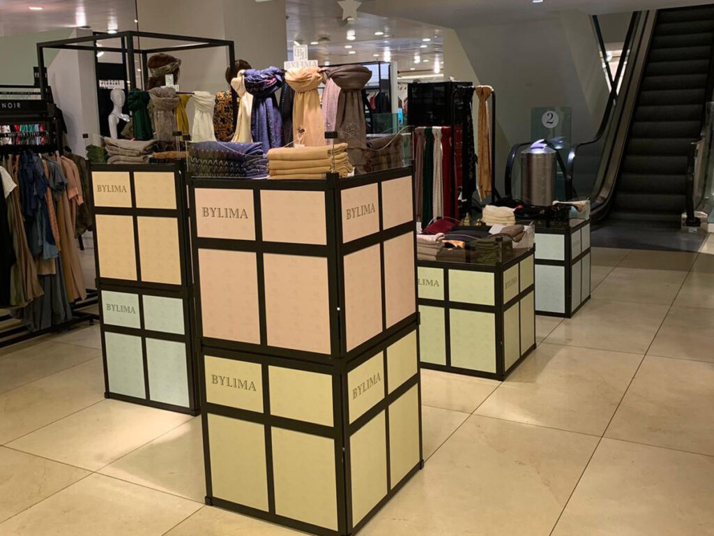
A display is often evaluated as a standalone object: Is the design appropriate? Is the message clear? Is the finish good? In practice, however, a display always functions as part of a larger whole. What stands out on its own can be completely lost when the surroundings contain similar shapes, colors, and textures.
On a trade show floor, the majority of booths consist of vertical surfaces with graphic content. When a display conforms to that pattern, it becomes part of the backdrop. Visitors recognize it as information and walk right past it. This isn’t due to a lack of interest, but because the brain learns what can be ignored.
This happens especially when:
The result is a display that functions technically but is not visually noticed.
The first perception of a display almost always occurs while someone is walking. That moment is brief. At a distance of about three to five meters, there are at most one to two seconds to capture attention. Only then is there an opportunity to convey information.
This means that a display has two distinct functions: first, to attract attention; then, to engage the viewer. However, many displays are designed as if visitors first stop and then look. In practice, it’s the other way around. First, a subconscious decision is made as to whether something is worth approaching. Only then is there room for content.
During that initial perception, the viewer primarily looks for:
If a display is too complex at that moment, the viewer will lose interest before getting any closer.
A common reason why displays go unnoticed is that they try to convey too much at first glance. Text, images, and logos are presented all at once, while the viewer is still getting their bearings.
Text that is legible on a screen or in a proof loses its effectiveness as soon as the viewing distance increases. Images without a clear hierarchy blend together into a single plane. The message doesn’t disappear because it’s uninteresting, but because it’s presented at the wrong moment.
As a result, the display does not encourage people to come closer.
Placing a display “along the walking route” sounds logical, but it does not guarantee visibility. Walking routes determine where people walk, not where they look. The direction of gaze is influenced by movement, obstacles, and lighting.
Many displays are placed without explicitly considering visitors’ active field of view. As a result, important information can literally fall out of view.
Common positioning mistakes:
As a result, even a well-designed display can be structurally overlooked.
Visibility isn’t just a matter of graphics. Construction and the use of materials determine how a display behaves in light and space. Flat surfaces tend to blend into the background more quickly in environments with many similar surfaces. Materials with depth, texture, or layering refract light differently and are therefore more likely to attract attention.
In addition, construction determines whether a display can adapt to the space. A system that works in only one configuration is dependent on ideal conditions. A more flexible construction makes it possible to adjust positioning or layout when the environment requires it.
When construction and materials contribute to visibility:
Standard displays are efficient and reliable, but they’re also easily recognizable. In environments where many parties use similar systems, visual uniformity results. That doesn’t mean standard solutions are bad, but it does mean they must be used deliberately.
When differentiation isn’t an explicit part of the design, the display becomes part of the background. It functions technically, but fails to serve as a focal point.
Situations where this occurs:
Are you looking for a standard display or a custom display?
Displays that are easily noticed are rarely larger or more cluttered than others. They are better tailored to the way people look and move. From a distance, they offer one clear reason to stop, and only then do they provide space for further engagement.
A display doesn’t have to scream to attract attention. It needs to align with viewing behavior, the environment, and timing. By distinguishing between initial perception and deeper engagement, by taking positioning seriously, and by thoughtfully selecting construction and materials, visibility becomes a design choice rather than a matter of chance. Explore the possibilities for your situation.
Anyone looking into trade show displays will quickly notice that prices vary widely. This difference stems from specific choices regarding design, materials, and usage. A trade show display is not a standard product with a fixed price, but rather a structure tailored to a specific application within a specific environment.
The cost of a trade show display is determined by its technical and functional characteristics. These characteristics influence how the display performs during transport, setup, and use on the trade show floor. This blog explains which choices affect costs and how different usage scenarios lead to different prices.
Table of Contents
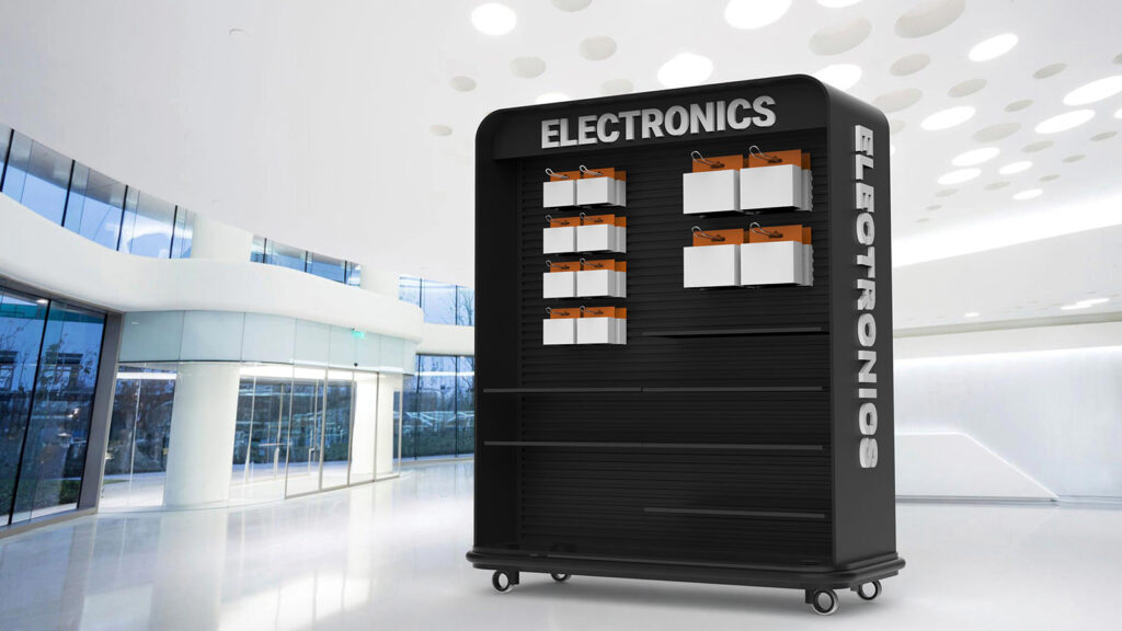
The price of a trade show display consists of several components. Two displays with similar dimensions can be constructed in completely different ways from a technical standpoint. This difference lies, among other things, in how components are connected, how stability is achieved, and what allowances are built in for repeated use.
A display that is assembled multiple times requires different structural solutions than one used only once. Connections are subjected to more frequent stress, tolerances account for wear and tear, and materials retain their shape during repeated transport. These choices are not immediately apparent in the design but have a direct impact on the display’s lifespan.
Price differences can generally be attributed to:
These factors are objectively measurable and, taken together, determine how long a display will remain functional without any loss of quality.
In substance, the question of cost goes beyond the purchase price. In practice, this question revolves around the relationship between investment and usage. A display becomes meaningful when it is clear how often and under what circumstances it will be used.
A low purchase price is appropriate for temporary use, while a higher investment makes sense when it leads to lower costs per use. That is why value is created by always considering costs in relation to usage.
The following factors, among others, play a role in this assessment:
Without this context, it is difficult to compare prices, and a price alone says little about the actual value.
Without context, a price means little. However, it is clear that trade show displays range from simple solutions for temporary use to technically complex structures for long-term and variable use.
The differences in cost are related to lifespan, reusability, and logistical efficiency. A display that lasts for several years and can be reassembled without modifications has a different cost structure than a single-use solution. This explains why prices vary within the same category.
When a trade show display is used in a fixed setup and for a limited number of events per year, the emphasis is on reliability and simplicity. The display does not need to adapt to other applications as long as it functions within the chosen context.
In this situation, solutions with a fixed shape and structure are often chosen. Components are designed for a single configuration, which keeps production and use straightforward.
H3: When is a standard display sufficient?
A standard display is appropriate when:
This ensures that costs remain aligned with usage. Investments in flexibility yield little functional benefit in this context.
As soon as a trade show display is used more frequently and must function in different configurations, the requirements change. Variations in booth dimensions call for components that can be repositioned, combined, or mirrored. This places higher demands on the construction, connections, and choice of materials.
In this situation, reusability becomes a decisive cost factor. Components remain usable for longer, and setup time and logistics remain predictable. A display not designed with this in mind leads, in practice, to on-site improvisation and accelerated wear and tear.
A custom display becomes relevant when:
The higher initial investment is due to technical requirements regarding flexibility, dimensions, and service life.
The choice of materials directly affects both the price and the performance of a display during use. Each material reacts differently to stress, transportation, and repeated assembly and disassembly. These properties determine whether a display is suitable for temporary or permanent use.
Cardboard displays are lightweight and efficient for temporary applications. They are ideal when low upfront costs and rapid production are important, but their usability is limited under prolonged stress.
Wooden displays offer greater stability and are suitable for long-term use. They combine sturdiness with a professional appearance but require special attention during transport and storage due to their weight and volume.
Metal displays are used when structural strength and modular use are required. They can withstand repeated transport and perform predictably during multiple setups and takedowns.
Magnetic displays allow components to be quickly moved or replaced. This simplifies reconfiguration but requires high precision in finishing to ensure consistent performance.
The cost of a display is directly determined by the technical properties of the chosen material and the associated fabrication process.
In addition to the purchase price, practical factors play a role in the total costs over the lifespan of a display. These costs become apparent after multiple uses.
Relevant cost factors include:
A display that is compact for transport and has a logical design structurally reduces these costs. Over time, this has a significant impact on total expenses. Would you like to learn more about professional display solutions?
An in-store display is much more than just a product holder. It’s a silent salesperson that attracts customers, creates a brand experience, and drives sales. The right in-store display or POS presentation can make the difference between blending into the crowd and truly standing out. But how do you choose a display that perfectly matches your brand, product, and target audience? At Dutch Display, we design custom displays for various industries—from retail and hospitality to healthcare and tourism—combining design, strategy, and functionality. In this blog, you’ll discover proven success factors, real-world examples, and industry-specific advice to help you make the best choice.
In deze blog:
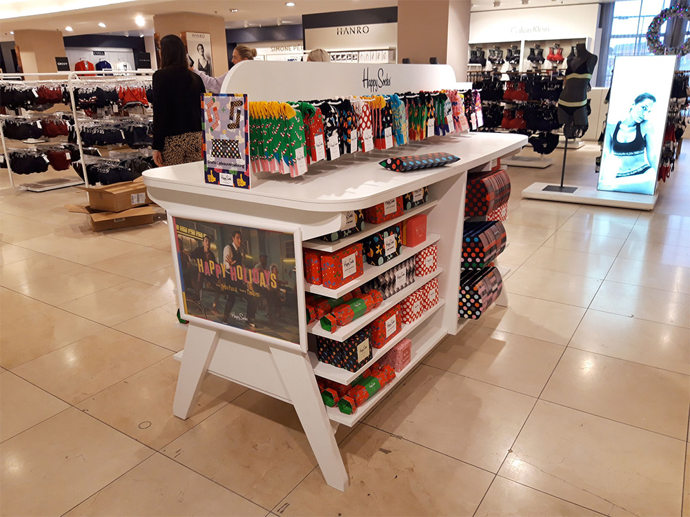
An effective display always starts with brand identity. Colors, style, and tone of voice must align seamlessly with your brand. Incorporate your logo, brand colors, fonts, and distinctive shapes. A luxury floor display for a high-end cosmetics brand requires a completely different look and feel than a cardboard promotional display for a seasonal sale at the supermarket.
Not every display serves the same purpose. Ask yourself:
The type of product also plays a role. A high-end product calls for a sophisticated presentation, while a promotional item benefits from bright colors and price visibility.
The location within the store largely determines the design and size of your product presentation. Near the checkout, compact counter displays work well for impulse purchases, while in the aisle or on the sales floor, eye-catching floor displays or shop-in-shop presentations ensure visibility. In the storefront window, the goal is to entice customers and draw them inside.
Tip: Consider not only the available space, but also customer flow, sightlines, and lighting.
The material of your display influences its appearance and lifespan.
Additional sustainability options: choose reusable modular systems that are easily customizable, use prints with eco-friendly inks, and opt for production processes with minimal CO₂ emissions to ensure your displays are both sustainable and effective.
A good display design combines beauty and practicality.
Modern displays go beyond mere physical presentation and increasingly incorporate digital technologies. Examples include digital screens for moving images and changing content, touchscreens with product information or ordering options, QR codes that link to additional content, reviews, or promotional offers, and even augmented reality that allows customers to virtually experience products.
Measurability and optimization
A display is only truly effective if you measure the results. Consider, for example:
Test different versions (A/B testing) and optimize based on data. This way, you’ll get the most out of your investment.
Every industry has different requirements for a display, which means that the design, choice of materials, appearance, and functionality must be tailored to the specific target audience and usage environment.
Eye-catching colors, bright lighting, and the ability to touch and test products. Rotate store displays regularly to maximize attention.
Stand out immediately, reinforce brand identity, and encourage interaction to attract and engage visitors.
Calm tones, hygiene, and clear information. Safe and accessible for all visitors.
A robust, high-quality look with space for product information and interactive elements such as touchscreens or augmented reality.
Interactive, visually educational, and child-friendly. Flexibly adaptable to themes or projects.
Luxury materials, personalization, and a consistent brand experience throughout all spaces.
Atmospheric imagery, inspiration, and incentives to book. Dynamic, visual presentations.
Consistent branding on table displays, menus, and promotional items. A combination of ambiance and clear communication.
Let your brand stand out with a custom display
The right display aligns perfectly with your brand strategy, target audience, and location. It combines a recognizable design with a practical layout, appropriate materials, and interactive elements where needed. At Dutch Display, we create custom displays that stand out, win over customers, and drive sales. No matter what industry you’re in, we’ll provide a presentation that reinforces your brand story and pays for itself.
Would you like to discover which display best showcases your brand and directly contributes to your sales results? Contact us today for personalized advice or request a no-obligation quote. Together, we’ll create a display that looks great and delivers a return on investment.
In een winkel wordt vaak pas op het laatste moment beslist welk merk of product iemand koopt. Een effectieve display kan op dat belangrijke moment het verschil maken. Het gaat niet alleen om een mooi meubelstuk, maar om een strategisch marketinginstrument dat inspeelt op psychologie, beleving en koopgedrag. Bij Dutch Display ontwerpen we maatwerkdisplays die precies aansluiten bij jouw merkidentiteit en doelgroep. Met de juiste combinatie van kleur, plaatsing, eenvoud en interactie zorgen we dat jouw product opvalt en verkoopt. In deze blog geven we je graag 10 tips voor een effectieve winkeldisplay waarmee jij je winkelpresentatie naar een hoger niveau tilt.
In this blog:
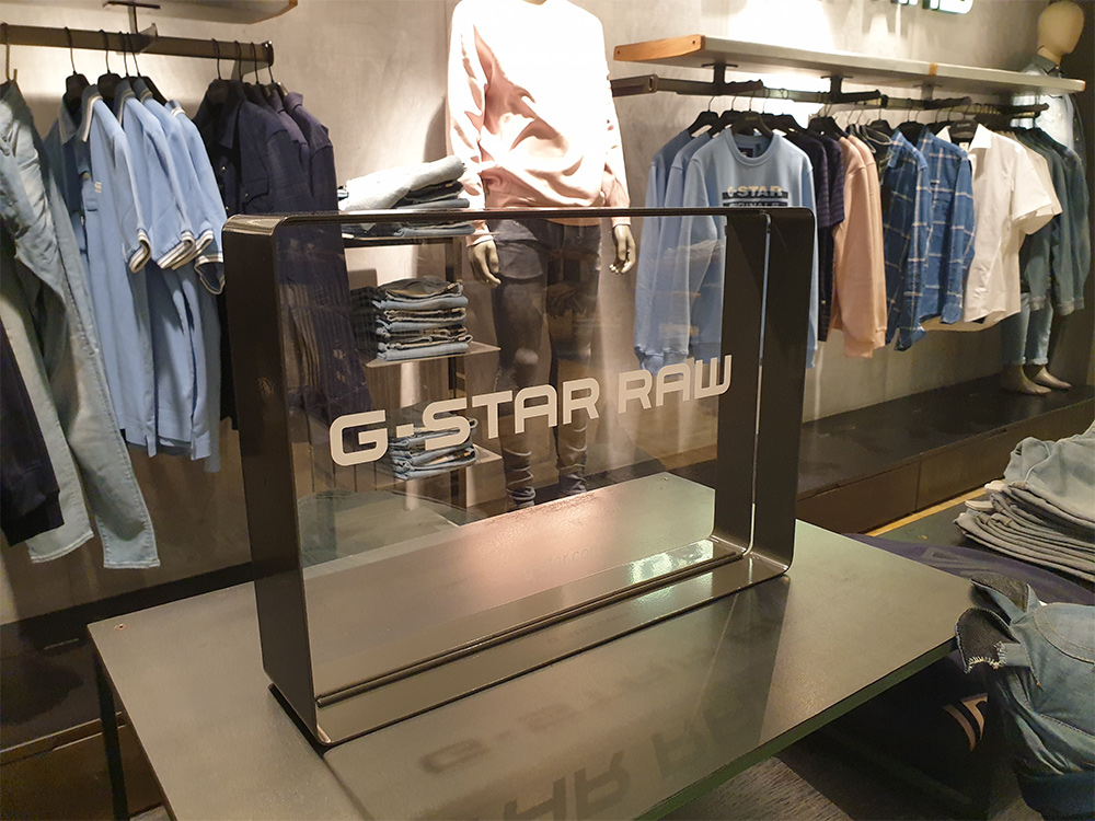
A good display starts with a clear understanding of who you want to reach.
By defining your target audience in advance, you’ll know exactly which colors, tone of voice, and style to use. This way, you can create a presentation that resonates with your audience.
No matter how beautiful a display may be, if it’s out of sight, it will hardly be noticed. Therefore, make sure to place your displays at eye level or along customers’ natural walking paths. Preferably choose high-traffic areas, such as near the checkout, at the end of aisles (end caps), or right at the entrance. Also, use strong color contrasts and eye-catching lighting to draw even more attention.
Example: A supermarket promotion featuring bright yellow price tags on a black background immediately caught people’s attention and doubled promotional sales.
Tip 3: Keep it simple and clear
A display should make it clear what you’re offering within three seconds.
The simpler the message, the faster the customer will make a decision.
Your display should be instantly recognizable as part of your brand. To achieve this, use your brand colors, logo, and standard fonts, and ensure that supporting elements such as price tags and visuals are consistent. A strong brand identity builds trust and increases brand recognition, making customers more likely to choose your product.
The product is the star of the show, not the display itself.
Extra tip: Display one product open or out of its packaging so customers can experience it better.
Include an element that literally makes customers stop and look.
Stopping power is the ability to literally bring busy shoppers to a halt.
Actively encourage customers to make a purchase by using clear and compelling messages, such as “Get yours now,” “Limited Edition—while supplies last,” or “2 for €5.” Place these messages prominently on the display, preferably at eye level and in eye-catching colors. A strong call-to-action grabs attention and can significantly increase conversion rates.
A display should be attractive and practical to use. Make sure it can be set up quickly without tools, is easy to restock, and is sturdy enough to remain in place for weeks without wearing out. Choose durable materials and a smart design so that the display always looks neat and well-maintained.
Keep your display up to date to stand out time and time again.
Example: A clothing store that changed its display theme monthly saw a 15% increase in repeat customers.
To measure is to know, so test your display by placing two versions in different stores and comparing sales figures. Also, ask for feedback from store staff and customers, and analyze which elements contribute most to conversion. Based on these insights, you can optimize your design step by step and thus increase the effectiveness of your in-store presentation.
Tip: Want to read more about how to create the best display for your industry? Check out our blog post How do you choose the best display for your brand and target audience.
Make Your Brand Stand Out with a Custom Display
A strong display catches the eye, tells your brand story, and drives customers to take action. At Dutch Display, we create custom displays that seamlessly align with your product and target audience. This ensures your brand gets noticed and immediately drives more sales on the store floor. Curious about which display works best for your brand? Feel free to contact us for personalized advice—we’re happy to help.
Walk down any shopping street and take a look around. What do you notice? More and more storefronts are empty. Or, at best, they’re filled with just a few products and a single sign. The atmosphere is gone, the story is missing, and you find yourself wondering: is this a store that’s open, or one that’s about to close? That’s striking, because the storefront used to be a store’s calling card—the place where you show who you are, what you sell, and why people should stop by. Why has that changed? And more importantly: what can you still do with it today?
In deze blog:
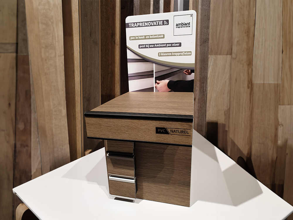
There was a time when storefront displays were little works of art. Each season had its own unique atmosphere. Designers worked with themes, colors, layers, and lighting. Mannequins were dressed, and products were carefully arranged. Passersby would stop for a moment—not because they wanted to buy something right away, but because it was fun to look at.
In many cases, it’s not a matter of unwillingness, but of time—or rather, a lack thereof. Store teams have gotten smaller, and campaigns follow one another more quickly. On top of that, window display design is a craft in its own right. Not everyone in the store knows where to start, let alone how to make a message visually appealing within a few square meters. So the window stays empty. Or something random is put in there, just so there’s at least something there. Some brands manage their displays entirely centrally, which in practice means standard posters are used, with no room for local input. The store manager isn’t allowed to change anything. And so the sense of involvement disappears. The result? Empty windows and a street scene that’s becoming less and less inviting to walk into.
An empty storefront is a missed opportunity. Passersby barely notice you—until they take notice. And that only happens when there’s something to see. Without a well-designed storefront display, you’re also missing out on opportunities outside of business hours—think evenings, Sundays, or simply the moments when someone is on their way somewhere else. In a well-designed storefront, your brand remains visible, even if someone doesn’t step inside. For brands, it’s just as important to be visible in a storefront. A campaign that looks great inside but remains invisible outside is literally missing half the story. It’s precisely in the storefront that your brand connects with the street level—and that’s where the difference is made. For example, with a storefront display.
A storefront doesn’t have to be complicated. It doesn’t have to change every week. But it does deserve attention. Because if you don’t show anything, you won’t be seen. Start with the storefront. Put something there that feels right. Something that says something. And if you’re not sure exactly what that should be? Then we’d be happy to help you create something that works. Contact us to explore the possibilities.